(( Beginner Tutorial )) Combining Colours
I've decided to create a tutorial on how to combine colours in relation to different types of patterns by adding a few useful links and examples, which I hope can be replenished time after time and be an inspiration for your knotting, our weekly contests and monthly challenges :)
Useful links on colours and colour combinations
*** Canva: 100 brilliant colour combinations (4 colors each) ***
This site is actually referring to web design, but I think the colour patterns shown there can be a good inspiration for bracelets, too ;) - Here's one example:

*** Colourlovers.com ***
Here you can find a large number of colours with their HEX-numbers and various colour schemes created by users all over the world.
***28 tools for choosing a colour scheme ***
Colour palettes
There are several possibilities on how to combine colours and also general basic knowledge, which can be useful, but the effect of colour combination in knotting also depends on the pattern and on how the colours are distributed in this pattern.
Complementary colours and contrasts
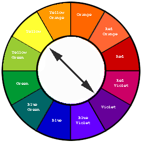
Apart from black and white, colours, which are opposites on the colour wheel and called complementary go very well together in general. We have luminous, vibrant colours and their variations here, such as blue and turquoise or yellow and orange. Patterns with 3-5 colours, which have black- or white-bordered elements or stained-glass-patterns usually work very well with complementary colours.
Pastels
Pastel or candy colours are light colours, which contain more white. When combined in bracelets, which has a very springy effect, they shouldn't be too light in bracelets, otherwise they can't be well differentiated from another and melt together. Pastel colours work very well in combination with gray, where they have a cold character, or green and also with floral patterns (in combination with a vibrant colour), because they have a very light, springy character.

Gradients
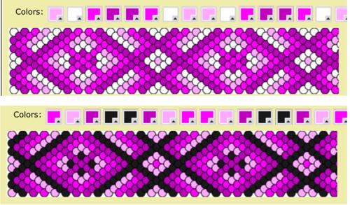
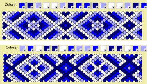
Gradients can have a great and rather luminous, as well as a 3D-effect with some patterns, especially when they are combined with black and white. For patterns with ten colours or more, it's nice to try two gradient schemes, which are at the same time complementary.
Examples of different colour combinations from the palettes on the same pattern
example with #88267
Pink gradients:
Blue gradients:
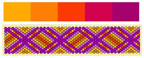
Orange gradients with teal complementary and vice versa:

Complementary colours, yellow and purple:

Complementary colours, pink and green:

Pastel colours with light background:

Typical colour schemes
EARTH and AUTUMN COLOURS

examples with #89018

SEA and BEACH COLOURS

examples with #89018

SUNSET COLOURS
examples with #89018
RAINBOW, TROPICAL and CANDY COLOURS

examples with #86846
IMPACT OF CHANGING JUST ONE COLOR

BLACK OR WHITE AS ?MAIN? COLOR

Links to related tutorials
Edit and Save Normal Pattern Colours
I might add other typical schemes or pattern examples as well as some interesting picture reference in the future... Hope the tutorial inspires you even more to play around with colours :)
Editors
The original author of this tutorial is Arismende but it was also edited by kleinevos and fb101.

Comments